


Clients
An online affair.
Newism have partnered with agencies such as ArnoldFurnace, Euro RSCG and Leo Burnett from day one, because for us, it’s a natural fit. Our role with them has ranged from fast–turnaround campaign support, to long-term consultation on projects for their most valued brands.
Not every project is a huge one however, nor is every client, but that doesn’t diminish our focus. Bespoke projects give us the chance to flex our creative muscles and keep us innovating. It’s our unending attention to detail that turns our new clients into valued partners.
Clients
Newism helps brands and agencies build successful businesses online.
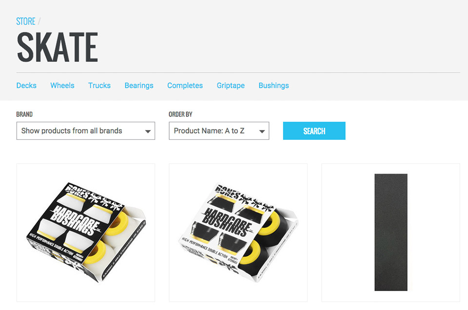
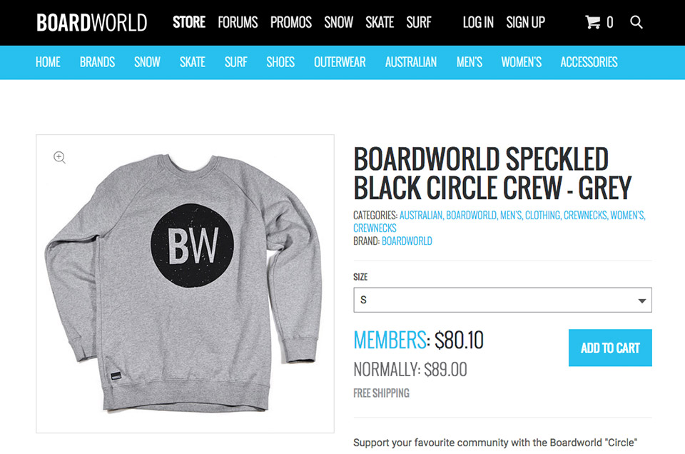
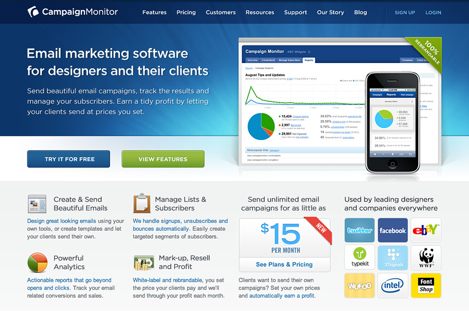
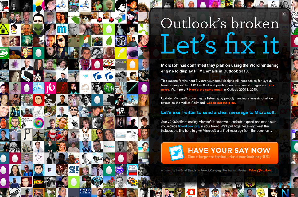
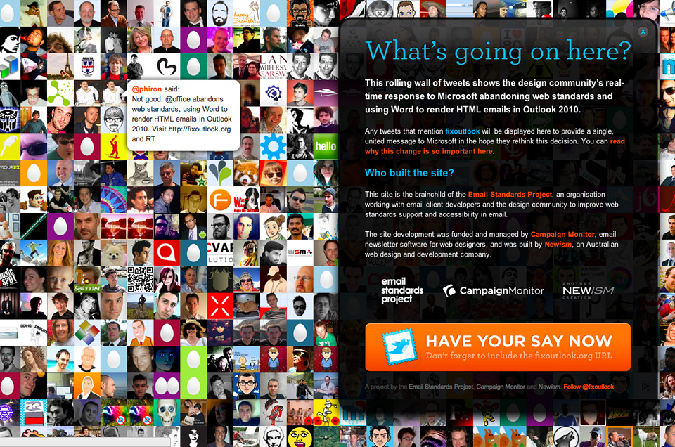
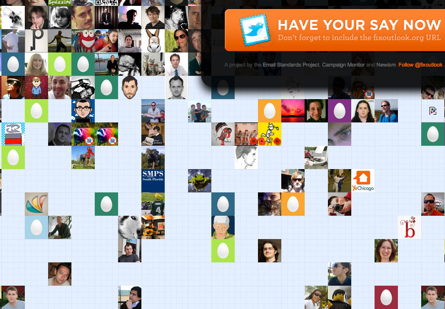
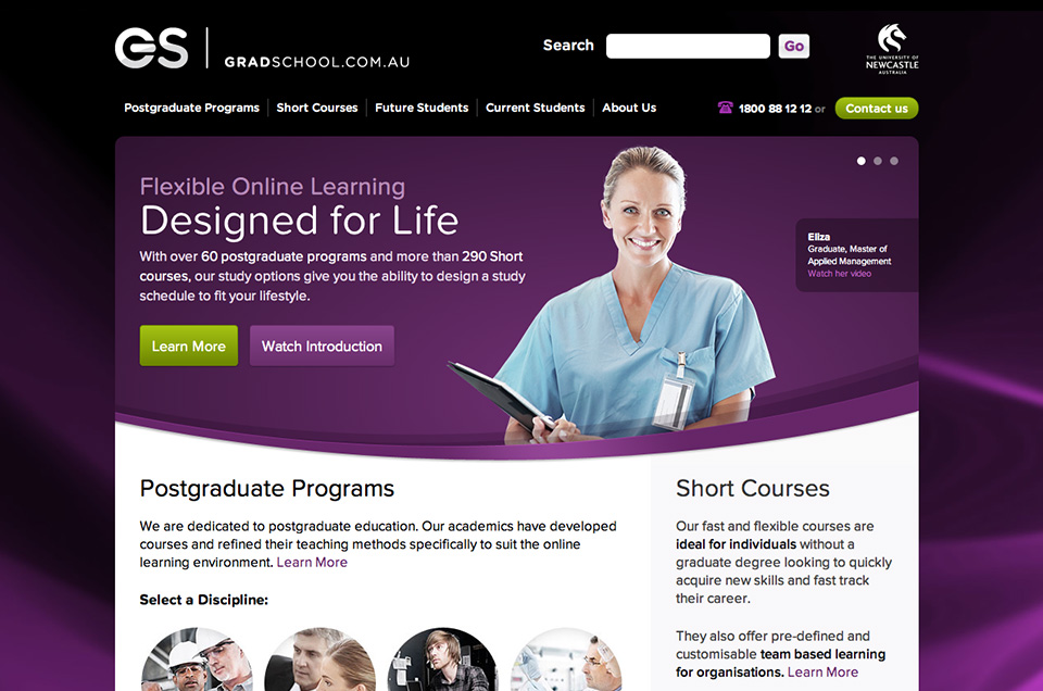
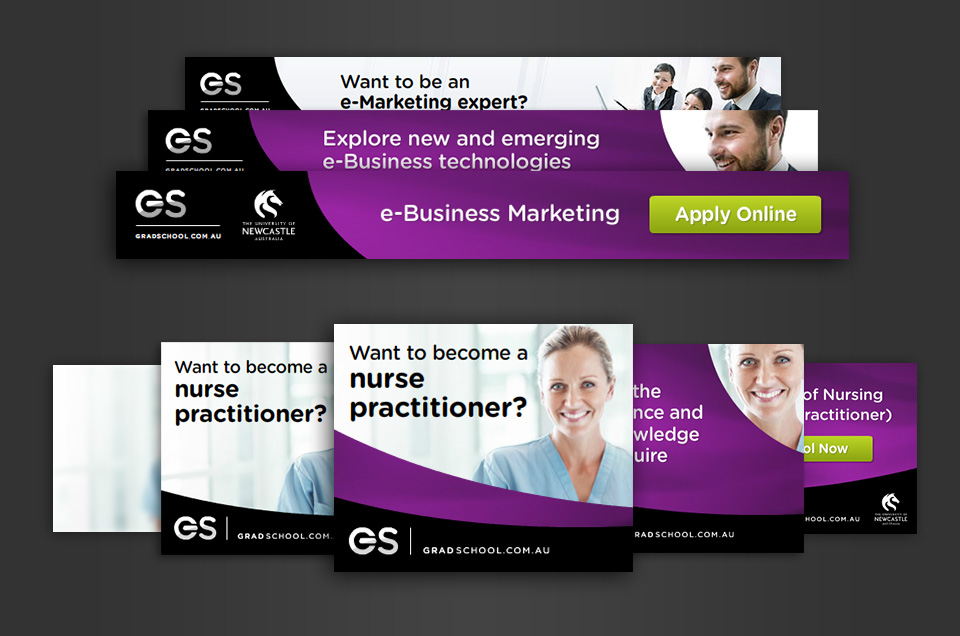
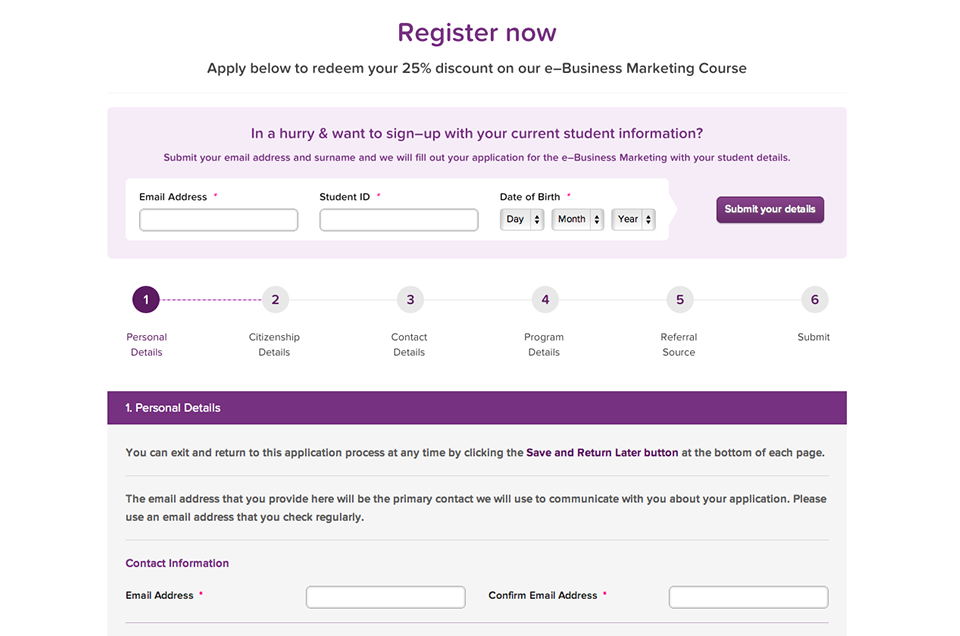
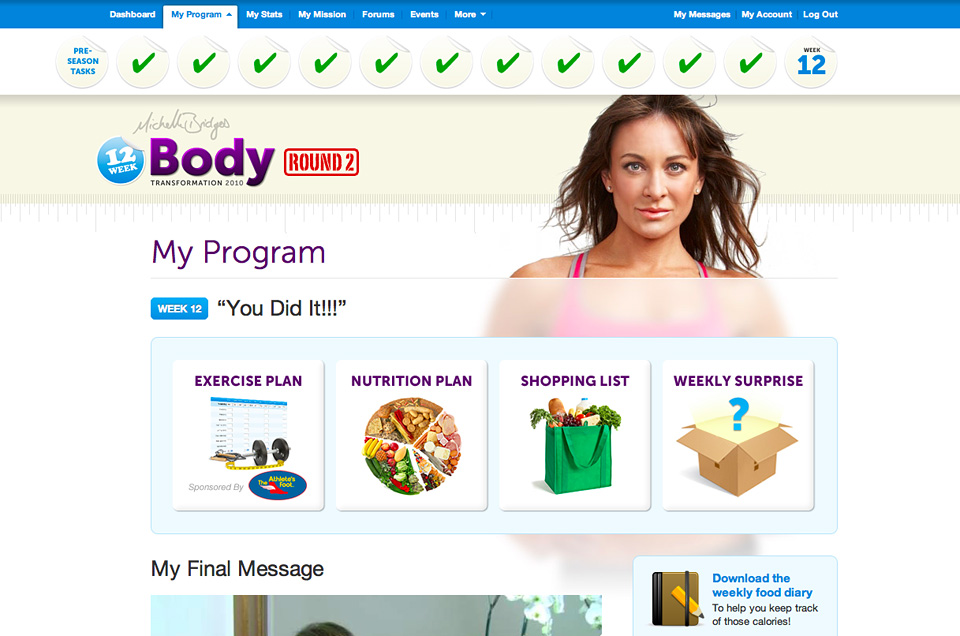
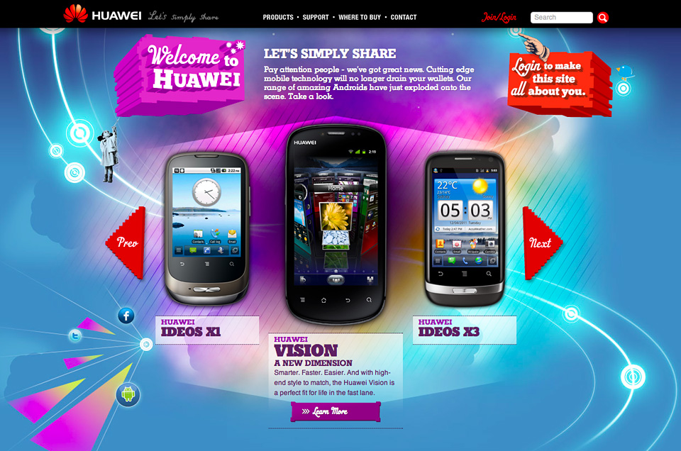
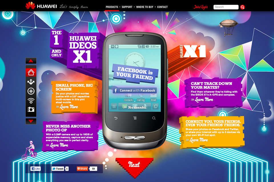
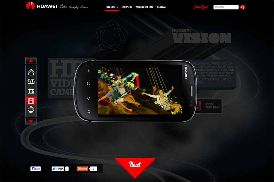
We’re not all post-it notes and info-graphics; occasionally we produce exceptional online content, like this:
- ExpressionEngine development
- Symfony development
- Social media (Facebook, Twitter, etc)
- Email marketing
- Online advertising
- Analytics
- Information architecture
- Interface design
- Front-end development
- CMS customisation
- Usability testing
Online Business Development
You’ve got an idea – how do you get it online and how do you ensure its success and longevity?
What platforms will enable rapid development and the ability to quickly pivot if your online strategy changes? How will this product be marketed? Which channels will get your product in front of the most engaged customer groups?
Our broad online experience means we’ve grown beyond just building websites – our focus is partnering with companies and start–ups who are after expert guidance and support in bringing their ideas to the web. We take our clients from project inception, through to sharing in the successes of their online business.
Our processes are structured and measurable, and are consistently refined to meet the needs of your business and the market.
People
A young, vibrant team of online professionals
Everyone in our team is an expert in their field, and that translates into great ideas and solid implementations of cutting-edge technology.
We have an easy-going culture, we’re all friendly and accommodating, and our clients have direct access to the team members working on their projects. This means responsive communication and happiness all round.
Work with us!
Newism are always on the lookout for creative new team members – think you’ve got what it takes to work with us? We’d love to meet you!

Leevi Graham
Executive Producer / Founder
leevigraham
Penny Redhead
Studio Manager / Director
pennyredhead
Iain Saxon
Developer
iainsaxon
Iain Henderson
Front-end Developer
ihenderson